
In a short text that could be read as an artist statement, Karel Marten claims it would be a matter of common sense and instinct that somewhere there is the right answer. Somewhere, he pictures a "box" and he describes the way to find the box and the key to the enclosed answer inside of the box a matter of choosing and giving this box a distinct color: "Alice blue. or alizarin crimson. or amber. or amethyst. or aqua. or aquamarine. or asparagus. or azure. or beige. or bistre. or black. or blue. or bondi blue. or brass. or bright green. or bright turquoise. or bright violet. or bronze. or brown. or buff. or burgundy. or burnt orange. or burnt sienna. or burnt umber. or camouflage green. or cardinal. or carmine. or carrot. or celadon. or cerise. or cerulean. or cerulean blue. or chartreuse. or chestnut. or chocolate. or cinnamon. or cobalt. or copper. or coral. or corn. or cornflower blue. or cream. or crimson. or cyan. or dark blue. or dark brown. or dark cerulean. or dark chestnut. or dark coral, or dark goldenrod. or dark green. or dark indigo. or dark khaki. or dark olive. or dark pastel green. or dark peach. or dark pink. or dark salmon. or dark scarlet. or dark slate gray. or dark spring green. or dark tan. or dark tangerine. or dark tea green. or dark terra cotta. or dark turquoise. or dark violet. or denim. or dodger blue. or eggplant. or emerald. or fern green. or flax. or fuchsia. or gamboge. or gold. or goldenrod. or gray. or gray-asparagus. or gray-tea green. or green. or green-yellow. or heliotrope. or hot pink. or indigo. or international Klein blue. or international orange. or jade. or khaki. or khaki (X11). or lavender. or lavender blush. or lemon. or lemon cream. or light brown. or lilac. or lime. or linen. or magenta. or malachite. or maroon. or mauve. or midnight blue. or mint green. or moss green. or Mountbatten pink. or mustard. or Navajo white. or navy blue. or ochre. or old gold. or olive drab. or orange. or orchid. or pale blue. or pale brown. or pale carmine. or pale chestnut. or pale cornflower blue. or pale magenta. or pale pink. or pale red-violet. or pale sandy brown. or papaya whip. or pastel green. or pastel pink. or Paul mauve. or peach. or peach-orange. or peach-yellow. or pear. or Persian blue. or pine green. or pink. or pink-orange. or plum. or powder blue. or Prussian blue. or puce. or pumpkin. or purple. or raw umber. or red. or red-violet. or robin egg blue. or royal blue. or russet. or rust. or safety orange (blaze orange). or saffron. or salmon. or sandy brown. or sangria. or sapphire. or scarlet. or school bus yellow. or sea green. or seashell. or selective yellow. or sepia. or silver. or slate gray. or spring green. or steel blue. or swamp green. or tan. or tangerine. or taupe. or tea green. or teal. or teené. or terra cotta. or thistle. or turquoise. or ultramarine. or viridian. or wheat. or white. or wisteria. or yellow. or zinnwaldite perhaps." In the end Martens completes his personal file of color names with the eventuality to leave and keep the box as it is.
In: Karel Martens, Full Color, Roma Publications, Amsterdam, 2013, p. 143-145
10/27/2014
9/13/2014
Dienstag Abend Chicago
Cover the fridge with painted paper, so to make a three-dimensional painting that relates and interacts to its place, its situation by color.
This can be made from water-based paint and simple packaging paper on a roll or thicker or millboard ... for the Pepsi-lightbox on top of the fridge I suggest a piece of cardboard. If the paper already has a color (like brown paper or cardboard) it shall be primed first. The color shall be applied roughly and thick, in several layers, necessarily on both sides of the surface. By doing so its form will get slightly waved but overall it will stay quite flat. Brush strokes can be visible, dripping might occur. In general it is preferable that the painted paper maintains a handmade look and a weighty body.
After drying the painted paper shall be cut out freely with scissors or cutter and makes therefor flowing edges. Three shapes are developed according to the silhouettes of the fridge's left and right side and its light box on top. The mounting shall be done with pieces of tape rolled into loops or double-sided adhesive tape. It must be invisible.
Two color propositions
1. Advanced. Try to imitate the color of the floor or something in its immediate vicinity, literally or practically touching the fridge. By my experience a color does not have to be a precise rendition in order to look similar to a neighboring one.
2. Easy. Make a color out of the available leftovers around. In this case the mixture is made at best from more than two paint sources. There can be primer added, more paint from a neighboring boot, some grey or what is in reach.
 |
| ArtReview presents Dienstag Abend, Expo Chicago, 2014 |
9/02/2014
1915 Pablo Picasso
In one of his letters Pablo Picasso aims to give his friend Guillaume Apollinaire a painter's advice. He argues that similar to the cannons, which back then were painted grey, the artillery would just as well remain visible to airplanes. Only the fact that they are jointly coated and dressed in solid colors would point out their form. Instead he suggests to daub the soldier's uniforms "with vivid colors and in bits of red, yellow, green, blue, white, like a harlequin."
In: Kenji Kajiya, The Aesthetics of Camouflage: The Art of a Military Design and its Transformation in Art, 2001
In: Kenji Kajiya, The Aesthetics of Camouflage: The Art of a Military Design and its Transformation in Art, 2001
7/16/2014
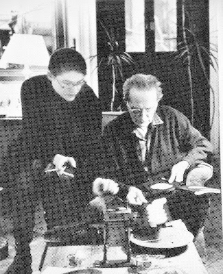
1967 Alison Knowles
Once she had the invitation to go to tea. She arrived at his door with eleven color swatches in her attaché case and the kindest smile on her face. She found a thin cloud of smoke floating above the open door; in no time the room was filled with people. Hands holding trays went high atop their heads. She kept herself in constant movement. She noted, order had become play.
So now about the color swatch: it was for him to select exactly the hue or tint of red-orange and blue that he wanted to have for the print that she was going to silkscreen later. Eleven times she had made a red circle on black Color-aid paper but in different intensities and each time overlapped it with a blue. There was Torch Red, Flame, Bittersweet. He chose one. The color swatch went on the windowsill and the ones he had not selected went back into her case. She thought, even though all is proceeding as foreseen, there must have been an irregularity somewhere along the way.
So the tea party proceeded and at some point his wife got up to go to the window, perhaps she wanted to open it. She looked down onto the windowsill and there was the color swatch, left out, designating his choice. She held it up and said, “When did you do this?” He got up from the table, walked over to the window, toward the fluttering paper and said, “Give me a pencil.” He signed the color swatch. He put the pencil down. After all he did not return to the table as he had left for the window.
Here the curtain falls vertically and the question is now, what is that? Is that a work of art? Is that something that helps in the methodology of doing the print? Is it one of his numerous rounds acted out in the moment?
The artifacts, in their arrangement, as they stood, showed a general affinity of opinions. They seemed neither unsettling nor distracting. Only the attaché case felt unnaturally heavy as she picked it up on the way out. Everything seemed fine. Nothing is wrong. And in the end there will be time.

Above: 10th Street, New York, 1967. Alison Knowles and Marcel Duchamp looking at color swatches, produced in connection with the silkscreen edition accompanying the cooperation on the Emmett Williams publication Sweethearts with Something Else Press in 1967.
6/04/2014
Vier "Hands" und Floralozone
 |
| Michael Part, 2003-2006 |
Hand 21
1 – Andy Partridge and Harold Budd, Hand 21
2 – Andy Partridge and Harold Budd, Missing Pieces of the Game of Salt and Onyx
3 – Jacob Kirkegaard, Labyrinthitis II
4 – Ø, Olematon
5 – John Hughes Daydream, Drinking Gasoline
6 – John Hughes Daydream, Terrible Things
7 – Heat Wave, Oakland, Slowmotion
Hand 22
1 – Andy Partridge and Harold Budd, Hand 22
2 – Delia Gonzalez and Gavin Russom, Rise
3 – James Murphy and Tim Goldsworthy, Rise Remix
Hand 20
1 – Andy Partridge and Harold Budd, Hand 20
2 – Moby, Is That You Mo-Dean Remix (Herparella)
3 – Mike Harding, Broken Rain
4 – People Like Us, In the Waking
5 – Jana Winderen, Mae Taeng
6 – J.O.Y., Sunplus A – Sunplus
7 – Hypnotic Brass Ensemble, War
8 – Roboterwerke, Rockbots (Stevie Kotey Edit)
9 – Moebius & Plank, Conditionierer
Hand 19
1 – Andy Partridge and Harold Budd, Hand 19
2 – Kraftwerk, Ohm Sweet Ohm
3 – Henrik Håkansson, Central Park
4 – A. Burger, Device C
5 – Henrik Håkansson, Central Park
6 – Penguin Cafe Orchestra, Sketch
7 – Martin Rev, My Strange World
8 – Moondog, Oasis
9 – Tin Man, Constant Confusion
10 – Virgo Four, Deep Blue
11 – Shed, Keep Time
12 – Ø, S-Bahn
13 – Kraftwerk, Klingklang
14 – Kelan Phil Cohran and Legacy, The Dogon
15 – Arthur Russell, Make 1, 2 (Gem Spa Dub)
16 – Starship Commander Woo Woo, Master Ship
Playlist in colaboration with Michael Part for Four Hands and Floralozone, Wellwellwell and Fluc, Vienna, 2014
Subscribe to:
Posts (Atom)