12/12/2015

1952 Ellsworth Kelly

In 1952 Ellsworth Kelly wanted to try something. According to his thoughts he produced Red Yellow Blue White. The work can be described as an early Hard-edge painting. It consists of five vertical panels separated on the wall and four occurring intervals of the wall surface between them. Each of the five panels is made up by a grouping of respectively five square-cut canvases; red, yellow, dark blue and white cotton fabrics he had purchased in the marketplace of a small fishing village in South of France, and which he stretched directly onto their supports. Following the strategy that he had explored in Paris with collages made from various found coated and uncoated colored papers, it is the only painting the artist ever did using actual industrially dyed fabrics of ready-made colors.
      In Random Order (October Books, 2003, p. 99) the art historian Branden Wayne Joseph takes up on Kelly's try and expects that he used the left over cloth from Red Yellow Blue White to make a dress for the artist Anne Weber. "Kelly's use of the same fabric for the dress of his friend Anne Weber only makes the equation between color and commodity in this particular work clear."
      All that remain of that dress are a collage by Ellsworth Kelly and a photograph of Anne Weber wearing it. In 2013 art adviser Sharon Coplan Hurowitz and women's creative director of Calvin Klein Francisco Costa worked with Kelly to recreate the dress as he had actually wanted it. It is composed of equally wide horizontal bands, made of modern fabrics in the fibers cotton, silk, nylon and elastane, rendered in a very limited-edition. As mentioned in Leslie Camhi's article In the Abstract: Ellsworth Kelly Creates a Limited-Edition Collection with Francisco Costa for Vogue, May 31, 2013, Kelly had anticipated within his works a way of “getting color off the wall and having it walk around the room.” The original intention remains present in the ten reinterpretations of the dress for Calvin Klein. One copy was donated to the Costume Institute of the Metropolitan Museum of Art in New York and one to the Philadelphia Museum of Art, whose permanent collection includes the work Red Yellow Blue White, the try that inspired the design of the dress at first.

12/08/2015

1979 Margaret Walch

"Nude Figure Blue / Joy Orange / Paper Pink / Cut-out Magenta / Gollage Green" are the color sample names in the section "The Colors of Matisse" in Margaret Walch's Color Source Book on page 89. They reassemble a selection of five primary colors in the hue and value that Matisse chose for his late paper collages. Among the palettes of other artists like Giotto, William Morris, or Sheila Hicks, the Color Source Book features significant color palettes of periods and art forms like Empire, Chinese porcelain, Scottish tartans, or Pop Art.

Through writing her own column on contemporary and historical fashion in the quarterly textile magazine American Fabrics (a guide for textile manufacturers with real physical fabric samples glued in it) Margaret Walch developed her expertise in the realm of color. In 1979 she published Color Source Book. It is the first of three color guides for both nonspecialist and professionals. In 1986 she became associated director of the Color Association of the US; an organization founded in 1915 to identify the direction of color trends, translate them into salable Color Forecasts in order to deliver the protocols to designers, retailers, and manufacturers. She points out, psychology, the economy, and our environment are the most important forces to influence our relation with color. High-visibility events, a celebrity, a movie, an artwork, anything that looks good has impact on our taste and values. Asked to pick her favorite color for 2008, she brings up Bamboo; a muted yellowed green, chosen from the associations' interior palette of the same year. She explains, in insecure times Bamboo “represents the stable green that is most on people’s minds.”

6/27/2015

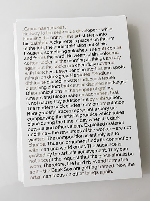
2015 Grace has success

Constanze Schweiger, "Grace has success", 2012.
Invitation card for "Para/Fotografie",  Michael Part and Artie Vierkant, Westfälischer Kunstverein, Münster, 2015

"Grace has success."


Halfway to the self-made developer – while handling the prints – the artist steps into his bathtub. A cigarette is placed on the rim of the tub, the undershirt slips out of his trousers, something splashes. The soft comes and forms the hard. He wears plain-coloured cotton socks. In the morning all things are dry again but the socks are cheerfully covered with blotches. Lavender blue mottles and spots mingle on dark-grey. He states, “Sodium dithionite diluted in water induces a textile bleaching effect that causes dappled markings.” Disorganizations in the shapes of grains, smears and blobs make an adornment that is not caused by addition but by subtraction. The modern sock eludes from ornamentation. Here graceful traces represent a story accompanying the artist’s practice which takes place during the time of day when it is dark outside and others sleep. Exploited material and time – the resources of the worker – are not wasted. The composition is entirely left to chance. Thus an ornament finds its connection with man and world order. The audience is excited by the artist’s achievement. They can not accept the request that the piece should be worn. Therefore, the hard rises and forms the soft – the batik sox are getting framed. Now the artist can focus on other things again.

Translated into English by Nicholas Hoffman, 2015
Original text in German, 2012

6/15/2015

2010 Olivia Giacobetti

As sometimes, there is a theme leading to an utterly tight bound composition. So tight that multiple accords and juxtapositions seem to fuse into one controlled sphere. Complete container or geometric volume – you have to inhale it and let yourself sink in order to get to the bottom of its obscure details. There is bitterness, a rarer and profound quality within a structure. There is green. There is powder and butter as in orris root. There are carrot seeds and filmy patchouli as from moist soil on roots. Carrot seeds and bitterness. Carrot seeds and powder. Carrot seeds and vanillized orange peel. There is sweetness. Sometimes bitter tastes sweet. This type of sweetness appears gauzy within floral systematics, and makes up for a clearly kinder feel. So as sometimes, a homely theme with its many seemingly recognizable components may lead you into the inner world of an imaginary object – a bubble or bobble or multilayer ball. It was a mistake to state that ... is a point it.

On Love les carottes by Olivia Giacobetti

In some other context a famous perfumer compared perfume to poetry, more precisely to "poems on souvenirs."

5/28/2015

1980 Design Office

In the short story "Honeymoon Habit" Kim Gordon tells about one of her early Design Office interventions. The clients, an artist couple sharing one room on 8 Spring Street, New York, had commissioned her to change their apartment  As part of her art practice, Gordon – widely known as a founding member of the band Sonic Youth – added a small mirror and a light with a metal shade to the place and spray-painted both of them in copper. "With the two new items added to the apartment and painted a color that is simultaneously street oriented, in a defined state, and rich looking, the project will not be resolved until the clients buy a smaller refrigerator."

"Honeymoon Habit" was originally published in Real Life Magazine's 5th issue, in winter 1980. The magazine was founded and edited by artist, writer, curator, Thomas Lawson, and artist, writer, Susan Morgan as an intermittent black and white magazine. It collects significant early writing by fellow artists and writers, a loose clique of the New York artworld of the Eighties. In 2014 it got included into the book Kim Gordon, Is It My Body? Selected Texts by Sternberg Press.


Constanze Schweiger, Untitled (Große Neugasse 44), 2015
Part of Kim Gordon: Honeymoon Habit by Anne Speir and Constanze Schweiger, pinacoteca, Vienna
Photo: Thomas Ries

On the occasion of the 2014 show Design Office: Coming Soon presented by Gagosian Gallery at Fitzpatrick-Leland House, Los Angeles, Kim Gordon recounts: "Design Office began in 1980 as a way to practice art outside of the gallery system. The first projects involved friends’ apartments. D.O. was to be sort of a reflective intervention into the lifestyle of the clients. Objects and a physical change to the interior based on the personality and desires/needs of the client. The design activity was not meant to be well executed or look a certain way, have a certain look or style. If anything it was a lo-fi aesthetic using or recycling other aesthetics."

5/15/2015

1961 Claes Oldenburg

In Claes Oldenburg's famous artist statement for the Environments, Situations, Spaces catalog (Martha Jackson Gallery, New York, 1961) he brings together an extensive list of associated forms and states that art can take in order to define vigorously his interest in the complexity of art and life. In "I am for an art that takes its form from the lines of life itself" he literally pictures a line that behaves and exists in our imagination in many diverse and familiar ways "that twists and extends impossibly & accumulates and spits and drips, and is sweet and stupid as life itself." He calls for art that one can smell or hear or smoke, that one can touch and interact with, that is a joke, that makes no sense or that eventually fulfills a function; "art you can sit on" and "art that does something other than to sit on its ass" within the context of an established art institution. Oldenburg is "for an artist who vanishes, turning up in a white cap painting signs or hallways" and "for the art of bread wet by rain."