3/31/2016

Untitled (convey Regular, convey Regular Italic)

Weil du fragst – meistens bleibt wenig Zeit für das Schreiben, genauso gut lässt es sich aus dem Alltag auch nicht wegdenken. Der Auftrag zu einer Arbeit mit Schrift kommt von einer österreichischen Buchgestalterin. Sie hat vor einiger Zeit eine Schrift entwickelt, die nach gegensätzlich Kriterien ausgerichtet ist, um in verschiedenen Umsetzungen möglichst gut lesbar zu sein; Offset- oder Laser-gedruckt, eventuell projiziert oder ganz einfach am Bildschirm. Dazu fallen mir einige Texte ein, die mit den täglich anfallenden Aktivitäten Lesen, Schreiben und Veröffentlichen in Verbindung stehen, wie sie Hand in Hand gehen und nicht getrennt zu denken sind, wie wir sie mehr oder weniger irgendwie alle täglich tun. Ich stelle mir vor, man könnte Beschreibungen zu den Texten in dieser Schrift auf Stoff veröffentlichen, in einem Raum ausbreiten, danach aufrollen, in einer Ecke abstellen, nach und nach ein Stück davon abschneiden und wieder andere, anders verwendbare Objekte daraus produzieren lassen, eine Tasche oder ein Behältnis für ein Buch. Mir kommt das nicht so sehr anders vor als das, was wir so und so täglich mehr oder weniger alle irgendwie machen, beobachten und fühlen. So könnte man am Ende Behälter daraus herstellen, in die man alles mögliche oder einfach Bücher hineintun und mit sich tragen kann.
/
Because you asked – actually there is not much time for writing, while one can not think of a day without it. The assignment of an artwork involving typography came from an Austrian book designer, who some time ago, developed a font family on opposed criteria. It is designed for versatile applications and works homogeneously in various common formats and media; printed in offset or with an office printer, possibly projected or simply on the screen. A few texts that relate to the daily activities of reading, writing, and publishing come to my mind; how they go hand in hand, as they are inseparable today, like one practices them more or less continuously. I figure one could write descriptions of these text sources and print them in the mentioned font on fabric, disperse the fabric in the exhibition space, then roll it up, deposit it in some corner, gradually cut of parts, and produce other, differently destined objects like a tote bag or repository for a book. It does not seem so different to what we all so and so, more or less somehow do, observe, and feel. In the end, one could fabricate containers into which you can put anything or just books you want to carry with you.


3/05/2016

Dinge, die

Vorhang ... Absurd pathetische Form ... Bild ... im Aufheben am schönsten. ... hinter dessen Blende die Dinge faulen können zu Kunst ... Das was sie vorstellt und das was sie darstellt ... um sie allen anderen auszusetzen. (Excerpts from the book f by Jutta Koether, 1987, that where accompanying the exhibition Dinge, die)

Dinge, die Exhibition, Pinacoteca, Wien, 2016. Foto: Thomas Ries
Found textile (Barbara Post) stretched on frame 

2/29/2016

2016 Christophe Lemaire

“The best for the most for the least.” It was said that Christophe Lemaire picked up on Charles and Ray Eames' famous thoughts in an interview September 2016 on the launch of his latest collection with Uniqlo. Originaly the Eames were referring with their pithy sentence to William Morris and his wish not to "want art for a few; any more than education for a few; or freedom for a few."

Lemaire's Men collections somehow remind one on the great style of socialist writer and designer William Morris. Now I'd say, even better, with Lemaire Arts and Crafts goes Mod … for a few coy and cool that at least romanticize on socialism and democracy? Outfits, contrived and fabricated carefully into wardrobe pieces for the ones that take a little bit of distance, as the designer puts it himself.


Lemaire, Men Spring–Sumer 2017. Music: Witch, No Time, 1973 (Can’t You Hear Me?, Now-Again Records, 2016)

2/21/2016

1860s William Morris

In a publication by Catherine McDermott (Professor of Design at Kingston University in London and now director of the Cooper-Hewitt, National Design Museum in New York) on tradition and style in British fashion (Octopus Publishing Group Ltd, London 2002) one can find a photograph of the English designer, craftsman and socialist writer William Morris taken in the 1860s where he sits in a garden on a stack of wooden planks, encircled by different sorts of large scale textiles folded and nested beside him. McDermott finds in Morris a worthy example of the up to this day remaining middle-class English male disregard for fashion. "[His] look proclaims that one's personal values are more important than fashion," consequently opposed to the standards of the immaculate Victorian gentleman of wealth and respectability. We see him wear a loose-fitting wool suit and unstarched shirt, creasy plain trousers, practical and comfortable looking outdoor shoes, long ungroomed hair and beard – scruffy, disheveled but highly politicized like the creating and thinking man himself. In a later period of his life he adopted what McDermott calls a "more extreme version of dress" compiled from indigo-dyed shirts and a suit of blue serge, which later became the antetype uniform of a defined revolutionary.

12/12/2015

1952 Ellsworth Kelly

In 1952 Ellsworth Kelly wanted to try something. According to his thoughts he produced Red Yellow Blue White. The work can be described as an early Hard-edge painting. It consists of five vertical panels separated on the wall and four occurring intervals of the wall surface between them. Each of the five panels is made up by a grouping of respectively five square-cut canvases; red, yellow, dark blue and white cotton fabrics he had purchased in the marketplace of a small fishing village in South of France, and which he stretched directly onto their supports. Following the strategy that he had explored in Paris with collages made from various found coated and uncoated colored papers, it is the only painting the artist ever did using actual industrially dyed fabrics of ready-made colors.
      In Random Order (October Books, 2003, p. 99) the art historian Branden Wayne Joseph takes up on Kelly's try and expects that he used the left over cloth from Red Yellow Blue White to make a dress for the artist Anne Weber. "Kelly's use of the same fabric for the dress of his friend Anne Weber only makes the equation between color and commodity in this particular work clear."
      All that remain of that dress are a collage by Ellsworth Kelly and a photograph of Anne Weber wearing it. In 2013 art adviser Sharon Coplan Hurowitz and women's creative director of Calvin Klein Francisco Costa worked with Kelly to recreate the dress as he had actually wanted it. It is composed of equally wide horizontal bands, made of modern fabrics in the fibers cotton, silk, nylon and elastane, rendered in a very limited-edition. As mentioned in Leslie Camhi's article In the Abstract: Ellsworth Kelly Creates a Limited-Edition Collection with Francisco Costa for Vogue, May 31, 2013, Kelly had anticipated within his works a way of “getting color off the wall and having it walk around the room.” The original intention remains present in the ten reinterpretations of the dress for Calvin Klein. One copy was donated to the Costume Institute of the Metropolitan Museum of Art in New York and one to the Philadelphia Museum of Art, whose permanent collection includes the work Red Yellow Blue White, the try that inspired the design of the dress at first.

12/08/2015

1979 Margaret Walch

"Nude Figure Blue / Joy Orange / Paper Pink / Cut-out Magenta / Gollage Green" are the color sample names in the section "The Colors of Matisse" in Margaret Walch's Color Source Book on page 89. They reassemble a selection of five primary colors in the hue and value that Matisse chose for his late paper collages. Among the palettes of other artists like Giotto, William Morris, or Sheila Hicks, the Color Source Book features significant color palettes of periods and art forms like Empire, Chinese porcelain, Scottish tartans, or Pop Art.

Through writing her own column on contemporary and historical fashion in the quarterly textile magazine American Fabrics (a guide for textile manufacturers with real physical fabric samples glued in it) Margaret Walch developed her expertise in the realm of color. In 1979 she published Color Source Book. It is the first of three color guides for both nonspecialist and professionals. In 1986 she became associated director of the Color Association of the US; an organization founded in 1915 to identify the direction of color trends, translate them into salable Color Forecasts in order to deliver the protocols to designers, retailers, and manufacturers. She points out, psychology, the economy, and our environment are the most important forces to influence our relation with color. High-visibility events, a celebrity, a movie, an artwork, anything that looks good has impact on our taste and values. Asked to pick her favorite color for 2008, she brings up Bamboo; a muted yellowed green, chosen from the associations' interior palette of the same year. She explains, in insecure times Bamboo “represents the stable green that is most on people’s minds.”

6/27/2015

2015 Grace has success

Constanze Schweiger, "Grace has success", 2012.
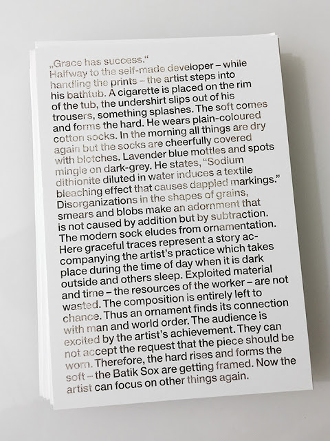
Invitation card for "Para/Fotografie",  Michael Part and Artie Vierkant, Westfälischer Kunstverein, Münster, 2015

"Grace has success."


Halfway to the self-made developer – while handling the prints – the artist steps into his bathtub. A cigarette is placed on the rim of the tub, the undershirt slips out of his trousers, something splashes. The soft comes and forms the hard. He wears plain-coloured cotton socks. In the morning all things are dry again but the socks are cheerfully covered with blotches. Lavender blue mottles and spots mingle on dark-grey. He states, “Sodium dithionite diluted in water induces a textile bleaching effect that causes dappled markings.” Disorganizations in the shapes of grains, smears and blobs make an adornment that is not caused by addition but by subtraction. The modern sock eludes from ornamentation. Here graceful traces represent a story accompanying the artist’s practice which takes place during the time of day when it is dark outside and others sleep. Exploited material and time – the resources of the worker – are not wasted. The composition is entirely left to chance. Thus an ornament finds its connection with man and world order. The audience is excited by the artist’s achievement. They can not accept the request that the piece should be worn. Therefore, the hard rises and forms the soft – the batik sox are getting framed. Now the artist can focus on other things again.

Translated into English by Nicholas Hoffman, 2015
Original text in German, 2012